
Storybook
Develop and document UI components in isolation with Storybook. Pre-configured for React with TailwindCSS, dark mode, and automatic documentation.
Key features
- Isolated component development
- Built-in TanStack Router and TanStack Start server-function mocking
- Interactive controls for props
- Automatic documentation generation
- Dark/light mode toggle
- Hot reloading
Running Storybook
Section titled “Running Storybook”bun run storybookOpens Storybook at localhost:6006 where you can browse all components.
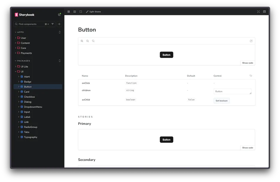
Writing Stories
Section titled “Writing Stories”Stories define the different states and variations of a component. They’re co-located with their components:
Directorycomponent-name/
- component-name.tsx Component implementation
- component-name.stories.tsx Storybook stories
- component-name.test.tsx Tests
- index.ts Public exports
Basic story structure:
import type { Meta, StoryObj } from "@storybook/tanstack-react"import { Button } from "./button"
const meta = {  title: "Packages/UI/Button",  component: Button,  parameters: {    layout: "centered",  },  tags: ["autodocs"],} satisfies Meta<typeof Button>
export default metatype Story = StoryObj<typeof meta>
export const Primary: Story = {  args: {    children: "Button",  },}
export const Secondary: Story = {  args: {    variant: "secondary",    children: "Button",  },}
Story organization:
| Location | Title Prefix | Example |
|---|---|---|
packages/ui/ | Packages/UI/ | Packages/UI/Button |
packages/ui-lite/ | Packages/UI-Lite/ | Packages/UI-Lite/Dialog |
apps/*/components/ | Apps/ModuleName/ | Apps/Brand/Hero |
TanStack Router in Stories
Section titled “TanStack Router in Stories”@storybook/tanstack-react wraps every story in an in-memory TanStack Router instance. Components that use @tanstack/react-router primitives, such as Link or navigation hooks, render without a custom decorator.
For stories that need a specific route, params, or loader data, use parameters.tanstack.router:
import type { Meta, StoryObj } from "@storybook/tanstack-react"import { BlogPostsList } from "./blog-posts-list"
const meta = {  title: "Apps/Blog/BlogPostsList",  component: BlogPostsList,  parameters: {    tanstack: {      router: {        path: "/blog",      },    },  },} satisfies Meta<typeof BlogPostsList>
export default metatype Story = StoryObj<typeof meta>
export const Default: Story = {  args: {    posts: [/* ... */],  },}
To render a TanStack Route object as the story component, pass it via parameters.tanstack.router.route and set params, query, or routeOverrides as needed. See the Storybook TanStack React docs for the full API.
Generating Components
Section titled “Generating Components”Use the create-component skill to scaffold new components with stories. In AI Agent chat, type /create-component.
This creates:
packages/ui/my-component/my-component.tsx- Componentpackages/ui/my-component/my-component.stories.tsx- Storiespackages/ui/my-component/my-component.test.tsx- Testspackages/ui/my-component/index.ts- Exports
Testing with Mock Data
Section titled “Testing with Mock Data”Use Faker.js (pre-installed) to generate realistic mock data in stories:
import { faker } from "@faker-js/faker"
export const Default: Story = {  args: {    title: faker.lorem.sentence({ min: 4, max: 6 }),    description: faker.lorem.paragraph(3),    email: faker.internet.email(),  },}