
Section
Storybook
Import
Section titled “Import”import { Section } from "@/brand/components/section"<Section id="features" title="Lorem ipsum dolor sit amet" description="Consectetur adipiscing elit, sed do eiusmod tempor incididunt ut labore et dolore magna aliqua."> {/* Your section content here */}</Section>title and description are both optional and can be used independently. The header block renders when either is provided.
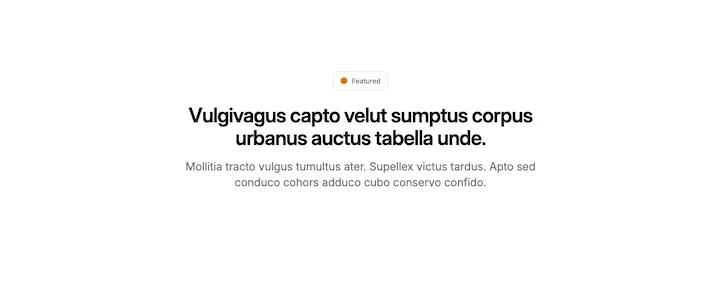
With badge:
import { Badge } from "@/ui/badge"
;<Section  id="cloudflare"  title="Lorem ipsum dolor sit amet"  description="Consectetur adipiscing elit, sed do eiusmod tempor incididunt ut labore et dolore magna aliqua."  badge={    <Badge variant="outline" className="px-3 py-2 text-muted-foreground">      <span className="mr-1 size-3 rounded-full bg-amber-600" />      Featured    </Badge>  }>  {/* Your section content here */}</Section>
Variants
Use background and spacingSize to adjust section appearance:
- background:
none(default),light,medium,dark - spacingSize:
default(default),sm,lg,none
<Section id="tech-stack" title="Lorem ipsum dolor sit amet" description="Consectetur adipiscing elit, sed do eiusmod tempor incididunt ut labore et dolore magna aliqua." background="medium" spacingSize="sm"> {/* Your section content here */}</Section>