Essentials
Essential UI components from shadcn/ui, a collection of re-usable components built with Radix UI and Tailwind CSS.
Button
Section titled “Button”
Import
import { Button } from '@/ui/button'Usage
<Button>Button</Button>
Import
import { Input } from '@/ui/input'Usage
<Input placeholder="Enter text..." />
Import
import { Link } from '@/ui/link'Usage
<Link href="/" size="default">Link</Link>
Import
import { Badge } from '@/ui/badge'Usage
<Badge>Badge</Badge>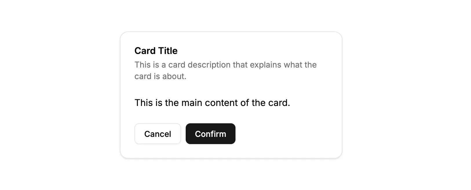
Import
import { Card, CardHeader, CardTitle, CardDescription, CardContent, CardFooter } from '@/ui/card'import { Button } from '@/ui/button'Usage
<Card> <CardHeader> <CardTitle>Card Title</CardTitle> <CardDescription> This is a card description that explains what the card is about. </CardDescription> </CardHeader> <CardContent> <p>This is the main content of the card.</p> </CardContent> <CardFooter> <Button variant="outline">Cancel</Button> <Button>Confirm</Button> </CardFooter></Card>
Import
import { Alert, AlertTitle, AlertDescription } from '@/ui/alert'Usage
<Alert> <AlertTitle>Alert Title</AlertTitle> <AlertDescription>This is a default alert.</AlertDescription></Alert>Checkbox
Section titled “Checkbox”
Import
import { Checkbox } from '@/ui/checkbox'import { Label } from '@/ui/label'Usage
<div className="flex items-center space-x-2"> <Checkbox id="default" /> <Label htmlFor="default">Default checkbox</Label></div>Dialog
Section titled “Dialog”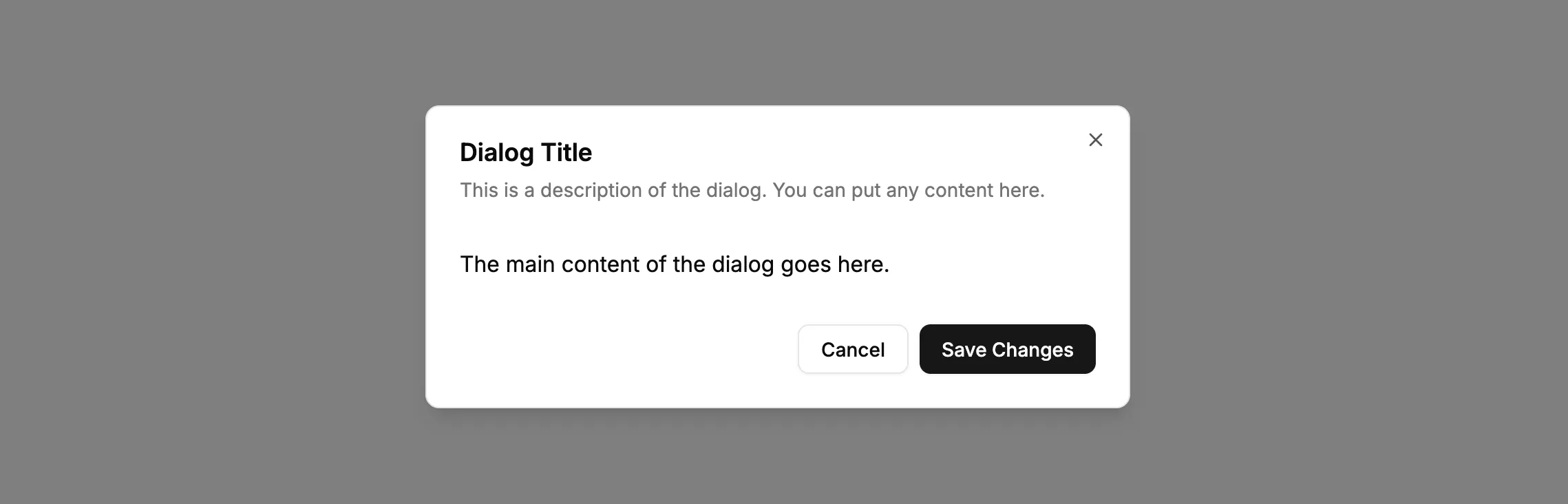
Import
import { Dialog, DialogTrigger, DialogContent, DialogHeader, DialogTitle, DialogDescription, DialogFooter } from '@/ui/dialog'import { Button } from '@/ui/button'Usage
<Dialog> <DialogTrigger asChild> <Button variant="outline">Open Dialog</Button> </DialogTrigger> <DialogContent> <DialogHeader> <DialogTitle>Dialog Title</DialogTitle> <DialogDescription> This is a description of the dialog. You can put any content here. </DialogDescription> </DialogHeader> <p className="py-4">The main content of the dialog goes here.</p> <DialogFooter> <Button variant="outline">Cancel</Button> <Button>Save Changes</Button> </DialogFooter> </DialogContent></Dialog>
Import
import { Label } from '@/ui/label'import { Checkbox } from '@/ui/checkbox'Usage
<div className="flex items-center space-x-2"> <Checkbox id="with-label" /> <Label htmlFor="with-label">Label with Checkbox</Label></div>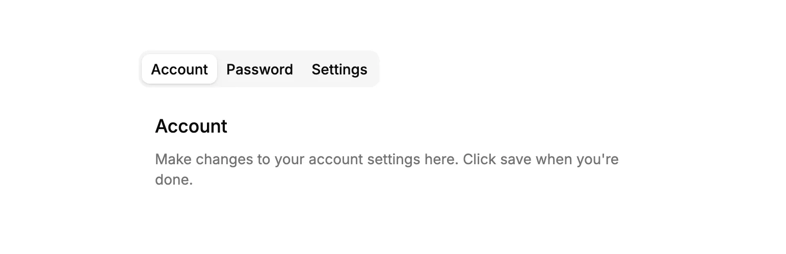
Import
import { Tabs, TabsList, TabsTrigger, TabsContent } from '@/ui/tabs'Usage
<Tabs defaultValue="account"> <TabsList> <TabsTrigger value="account">Account</TabsTrigger> <TabsTrigger value="password">Password</TabsTrigger> <TabsTrigger value="settings">Settings</TabsTrigger> </TabsList> <TabsContent value="account" className="p-4"> <h3 className="font-medium text-lg">Account</h3> <p className="mt-2 text-muted-foreground text-sm"> Make changes to your account settings here. Click save when you're done. </p> </TabsContent> <TabsContent value="password" className="p-4"> <h3 className="font-medium text-lg">Password</h3> <p className="mt-2 text-muted-foreground text-sm"> Change your password here. After saving, you'll be logged out. </p> </TabsContent> <TabsContent value="settings" className="p-4"> <h3 className="font-medium text-lg">Settings</h3> <p className="mt-2 text-muted-foreground text-sm"> Manage your account settings and set email preferences. </p> </TabsContent></Tabs>Typography
Section titled “Typography”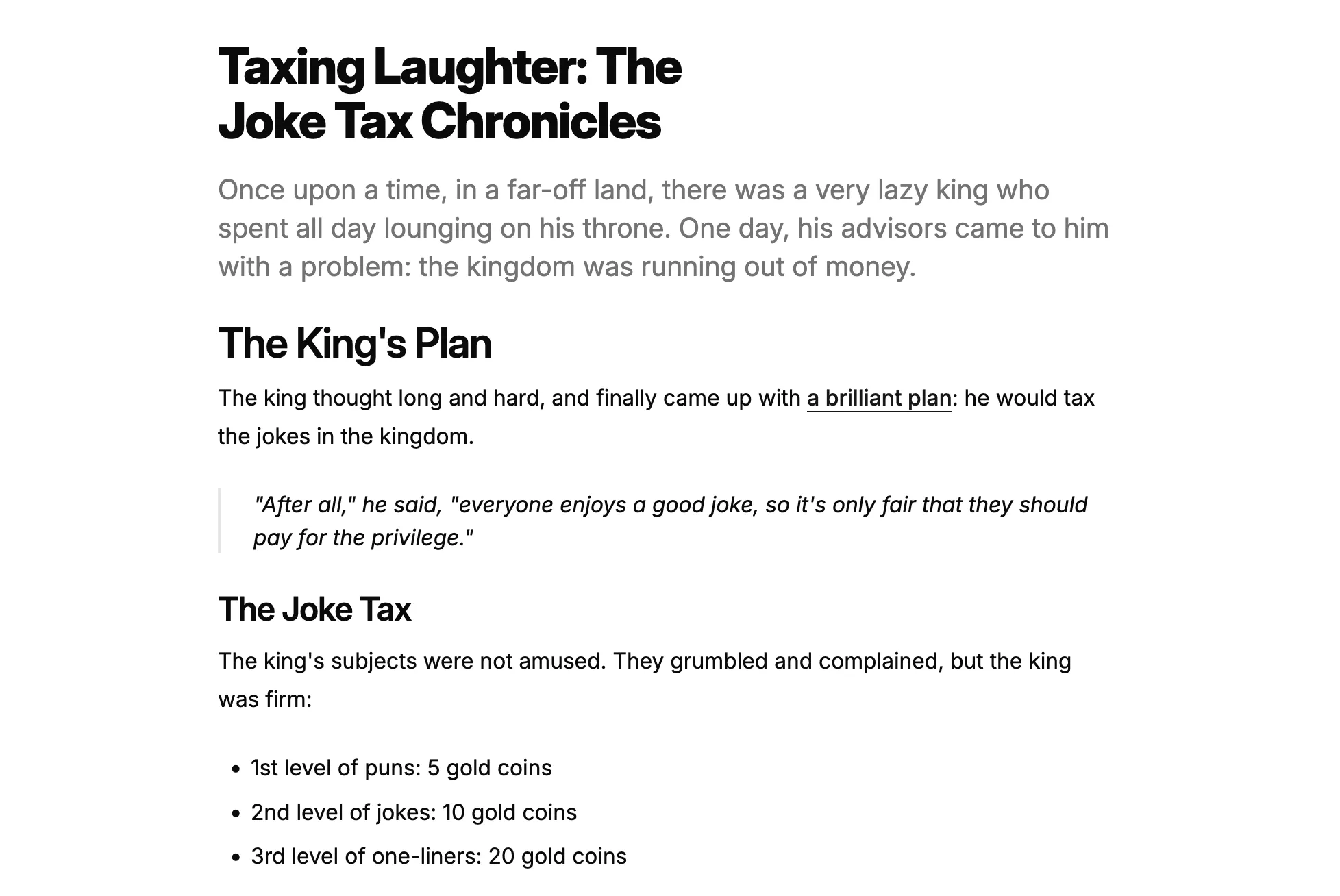
Import
import { Heading, P, Lead, Blockquote, List, Table, TableHeader, TableRow, TableHead, TableBody, TableCell } from '@/ui/typography'Usage
<div> <Heading level={1}>Taxing Laughter: The Joke Tax Chronicles</Heading> <Lead> Once upon a time, in a far-off land, there was a very lazy king who spent all day lounging on his throne. One day, his advisors came to him with a problem: the kingdom was running out of money. </Lead> <Heading level={2}>The King's Plan</Heading> <P> The king thought long and hard, and finally came up with{" "} <a href="https://example.com" className="font-medium text-primary underline underline-offset-4" > a brilliant plan </a> : he would tax the jokes in the kingdom. </P> <Blockquote> "After all," he said, "everyone enjoys a good joke, so it's only fair that they should pay for the privilege." </Blockquote> <Heading level={3}>The Joke Tax</Heading> <P> The king's subjects were not amused. They grumbled and complained, but the king was firm: </P> <List> <li>1st level of puns: 5 gold coins</li> <li>2nd level of jokes: 10 gold coins</li> <li>3rd level of one-liners: 20 gold coins</li> </List></div>Dropdown Menu
Section titled “Dropdown Menu”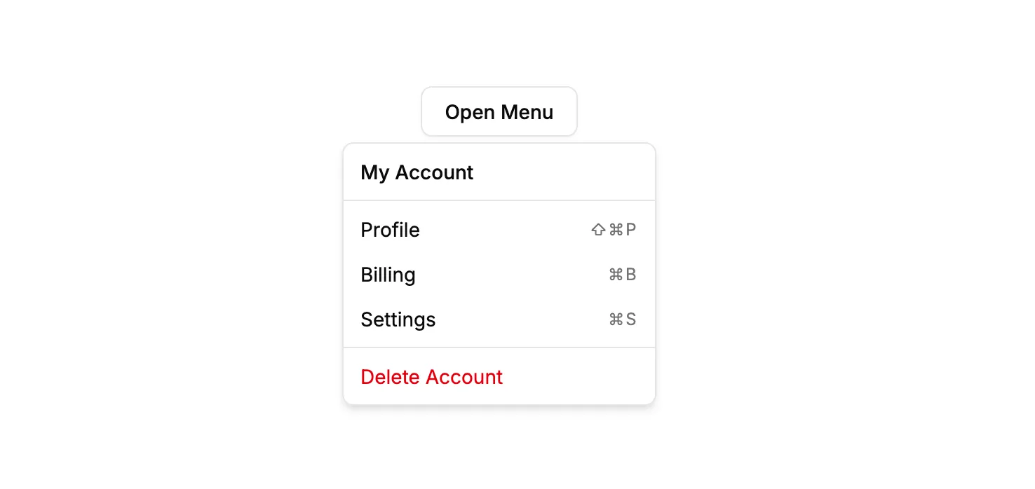
Import
import { DropdownMenu, DropdownMenuTrigger, DropdownMenuContent, DropdownMenuLabel, DropdownMenuSeparator, DropdownMenuGroup, DropdownMenuItem, DropdownMenuShortcut } from '@/ui/dropdown-menu'import { Button } from '@/ui/button'Usage
<DropdownMenu> <DropdownMenuTrigger asChild> <Button variant="outline">Open Menu</Button> </DropdownMenuTrigger> <DropdownMenuContent className="w-56"> <DropdownMenuLabel>My Account</DropdownMenuLabel> <DropdownMenuSeparator /> <DropdownMenuGroup> <DropdownMenuItem> Profile <DropdownMenuShortcut>⇧⌘P</DropdownMenuShortcut> </DropdownMenuItem> <DropdownMenuItem> Billing <DropdownMenuShortcut>⌘B</DropdownMenuShortcut> </DropdownMenuItem> <DropdownMenuItem> Settings <DropdownMenuShortcut>⌘S</DropdownMenuShortcut> </DropdownMenuItem> </DropdownMenuGroup> <DropdownMenuSeparator /> <DropdownMenuItem variant="destructive"> Delete Account </DropdownMenuItem> </DropdownMenuContent></DropdownMenu>Radio Group
Section titled “Radio Group”
Import
import { RadioGroup, RadioGroupItem } from '@/ui/radio-group'import { Label } from '@/ui/label'Usage
<RadioGroup defaultValue="option1"> <div className="flex items-center gap-3"> <RadioGroupItem value="option1" id="option1" /> <Label htmlFor="option1">Option 1</Label> </div> <div className="flex items-center gap-3"> <RadioGroupItem value="option2" id="option2" /> <Label htmlFor="option2">Option 2</Label> </div> <div className="flex items-center gap-3"> <RadioGroupItem value="option3" id="option3" /> <Label htmlFor="option3">Option 3</Label> </div></RadioGroup>